My Experience Building This Website
# Introduction: Why Share This?
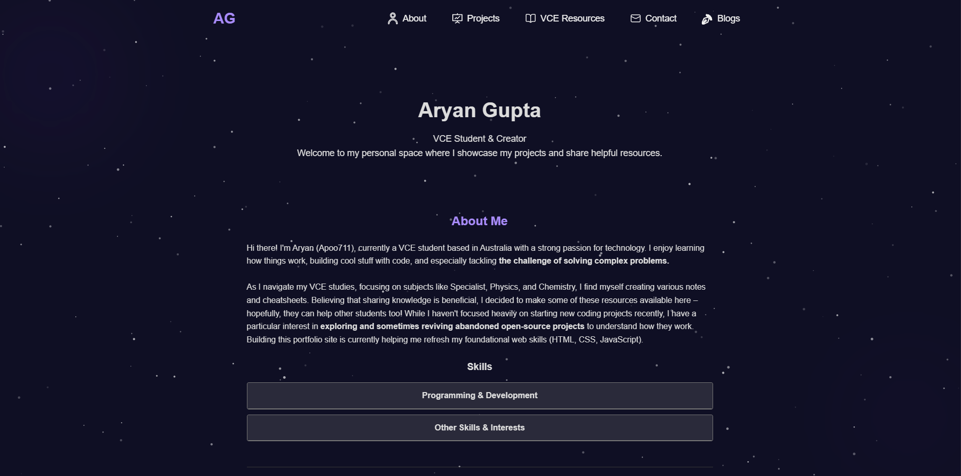
Welcome to the very first blog post on My Portfolio! While the primary mission here is to arm you with top-notch VCE resources, I thought pulling back the curtain on how this site was built might be an interesting read. For fellow aspiring developers, students curious about web development, or just anyone wondering what goes into creating an online resource, this one’s for you.
This isn’t just about lines of code; it’s about the problem-solving, the “aha!” moments, the inevitable frustrations, and the satisfaction of bringing an idea to life. So let’s dive into the journey of building this platform.
# The Spark: Where the Idea Came From
Every project, big or small, starts with a spark. For me, the idea for this website wasn’t a sudden lightning bolt but more of a slow burn, fuelled by my own experiences and observations. As a current VCE student myself, I noticed how most resources available for students were often paywalled. The few free sources that were available were great, but were outdated in some cases.
I envisioned a clean, accessible space where students could quickly find reliable resources without getting lost in a maze of forums or outdated links. The goal was to create something genuinely helpful.
# Planning and Tech Choices: Laying the Foundation
Choosing the right technology stack is always a crucial decision. For this project, I opted for:
- Hosting: GitHub Pages. It’s free for public repositories, integrates beautifully with Git for version control (an absolute lifesaver!), and is fantastic for serving static sites like this one.
- Core Technologies: I decided to build the site primarily with HTML, CSS, and vanilla JavaScript. While frameworks are powerful, I wanted to keep things lightweight, ensure fast load times, and have granular control over every aspect. It also felt like a good way to reinforce foundational skills.
- Version Control: Git and GitHub. Non-negotiable for any development project, in my opinion. It allows for tracking changes, collaborating (even if it’s just with your future self!), and rolling back if something goes spectacularly wrong.
Here’s a very basic example of the HTML structure I used for a typical resource listing item. The actual implementation has a bit more to it for styling and functionality, but this gives you an idea:
<h3>General Notes & Summaries</h3>
<ul class="resource-list">
<li>
<a href="Link to file..." download>Complex Numbers Summary (PDF)</a>
- Overview of complex number operations and De Moivre's theorem.
</li>
<li>
<a href="Link to file..." download>Calculus Notes (PDF)</a>
- Covers differentiation and integration techniques relevant to Spec Maths.
</li>
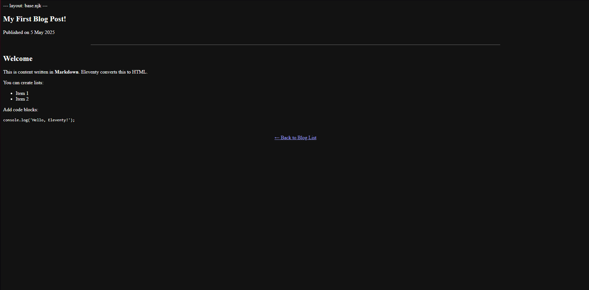
</ul># The Building Process: Bringing it to Life
With a plan and tech stack decided, the real work began: translating ideas into a functional website. My process generally involved:
- Structuring the Content (HTML): Building the semantic skeleton for each page type – homepage, subject pages, resource listings, blog posts.
- Styling (CSS): Applying the visual design. This was an iterative process, starting with a basic layout and progressively refining the look and feel, focusing on readability and a clean user interface. I made heavy use of CSS Flexbox and Grid for layout.
- Adding Interactivity (JavaScript): Implementing any dynamic features, like a mobile navigation menu, search/filter functionality (a future goal!), or smooth scrolling.
One of the first major components I tackled was setting up the system for displaying the VCE resources. This involved thinking about how to categorise them and make them easily discoverable.
Ensuring the website was fully responsive was a top priority. This meant a lot of testing across different screen sizes and tweaking CSS. Here’s a little CSS snippet that helps manage the layout of resource cards on different screen sizes using Flexbox:
.resource-list {
  list-style: none;
  padding-left: 0;
  margin-top: 0;
  margin-bottom: 15px;
}

.resource-list li {
  margin-bottom: 18px;
  padding-left: 30px;
  position: relative;
  line-height: 1.5;
  color: #ccc;
}

.resource-list li::before {
  content: '\f019';
  font-family: 'Font Awesome 6 Free';
  font-weight: 900;
  position: absolute;
  left: 0px;
  top: 3px;
  color: #a78bfa;
  font-size: 1em;
}
# Challenges I Faced (And How I Tackled Them)
It wouldn’t be a real development story without a few curveballs! Here are a couple of notable challenges:
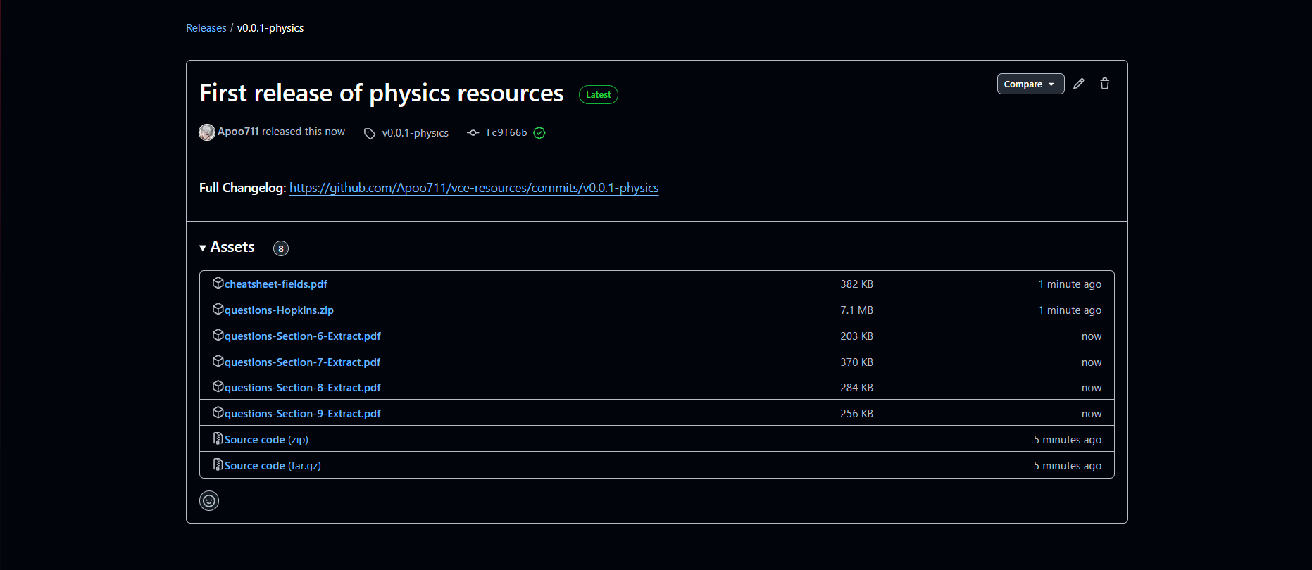
- Challenge 1: The Dreaded Bandwidth Question
One of the biggest initial headaches was figuring out the best way to host and serve the PDF resources, especially considering potential bandwidth limits with free hosting. GitHub Pages has soft limits, and while GitHub Releases is excellent for larger files, I also explored external options.- Solution: After much research and weighing pros and cons (including cost, ease of use, and reliability), I decided to initially leverage GitHub Releases within a separate repository. This involved creating a separate repository dedicated to releases and linking to those assets. It’s an area I’ll continue to monitor and adapt if the site grows.
# Challenge 2: Perfecting the “User-Friendly” Vibe
It’s one thing to make a site functional; it’s another to make it genuinely user-friendly and intuitive, especially for students who might be stressed and short on time. I spent a lot of time tweaking navigation, information architecture, and even font choices.
- Solution: I focused on simplicity. I tried to put myself in a VCE student’s shoes: What would I need to find quickly? How can I reduce clicks? I also asked a few friends to test early versions and provide honest feedback, which was incredibly valuable for identifying confusing elements or awkward workflows.
# Key Learnings and Takeaways
This project has been a fantastic learning curve. Beyond the technical skills, here are some broader lessons:
-
Start Simple, Iterate Often: It’s tempting to want to build everything at once, but starting with a core set of features and then building outwards is much more manageable.
-
The Value of Good Structure: Well-organized code and content make a world of difference, not just for me maintaining the site, but hopefully for users navigating it too.
-
Don’t Underestimate Design: Even for a resource-focused site, thoughtful design significantly impacts usability and the overall user experience.
-
Community is Key: While I built this solo, the wealth of knowledge shared by the developer community online (blogs, forums, documentation) was indispensable. Never hesitate to search for solutions or learn from others.
-
Persistence Pays Off: There were definitely moments of staring blankly at a bug at 1 AM, but pushing through those challenges is incredibly rewarding.
# What’s Next?
This is just version 1.0! I have a list of ideas and improvements I’d love to implement over time:
-
Expanding the range of subjects and resources available.
-
Adding more interactive study tools or checklists.
-
Perhaps a dedicated section for VCE news and exam tips.